Wilfrid Laurier University
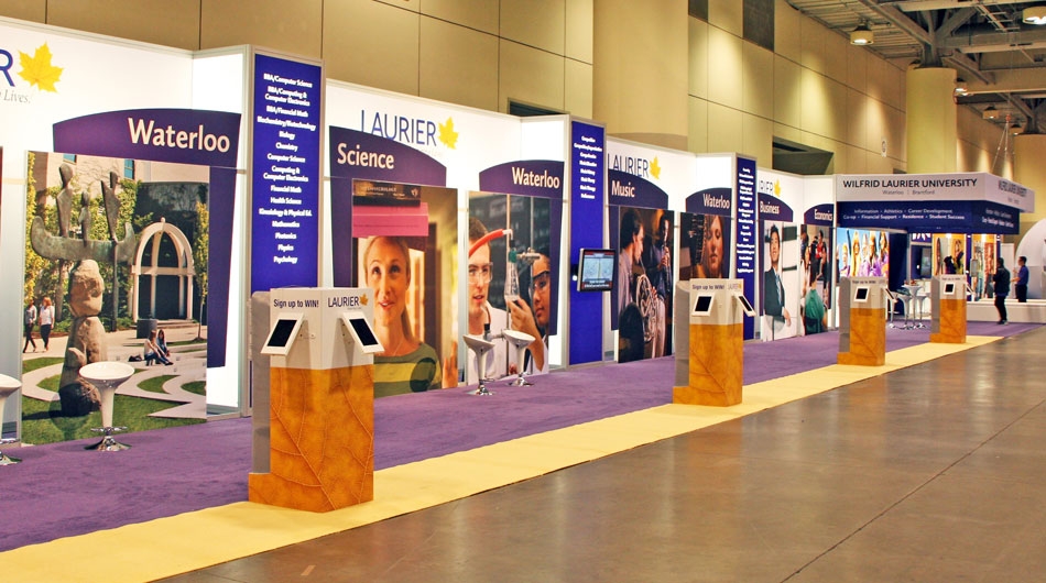
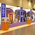
165 x 15 modular booth exhibiting annually
Objective
To design an exhibit that considers Wilfrid Laurier University's vision, while ensuring that the exhibit reflects a true sense of their two campuses in a way that engages their target audience. Over a three-day period, 120,000 attendees visit the OUF to evaluate and compare 21 post-secondary institutions. The exhibit needed to present the community and academic traditions at Wilfrid Laurier. A key strategy was to gather as many student contacts as possible, and to clearly show a wide range of academic programs. A balance of student life and community was to be interwoven into the informative elements of the environment. An open, welcoming space with strong branding was the primary objective.
Solution
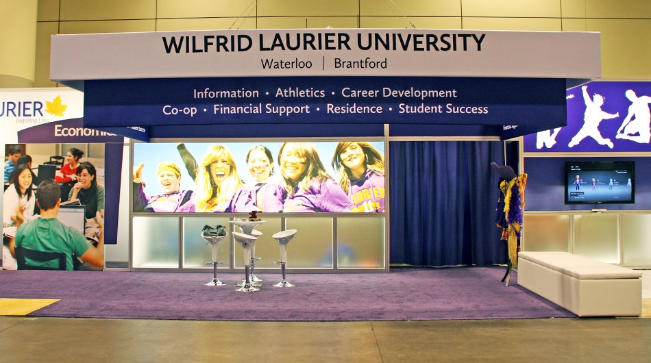
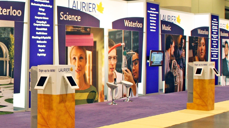
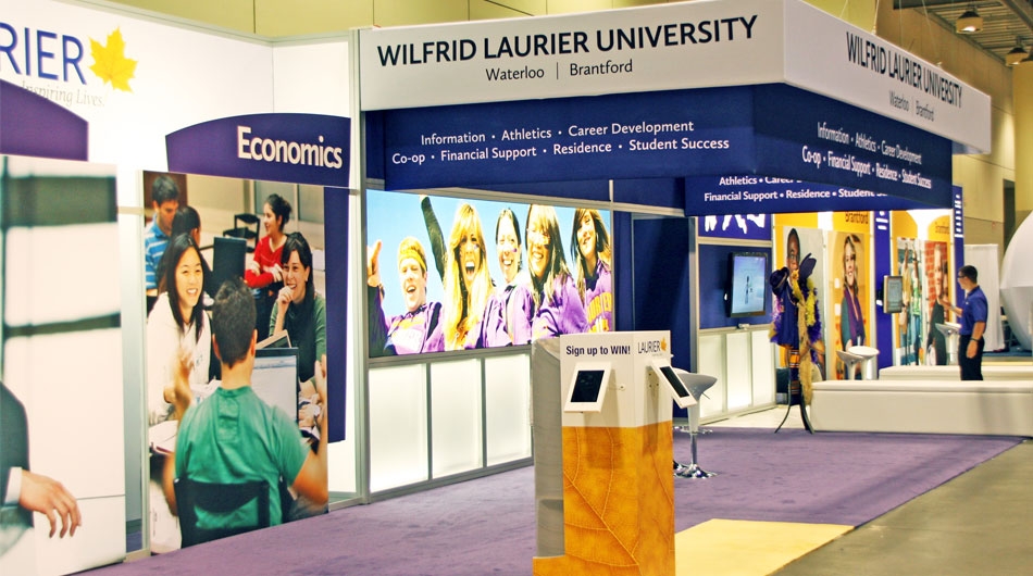
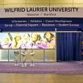
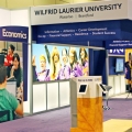
Stevens E3 developed a design with state-of-the art touch screens and ipads generously dispersed throughout the booth space to maximize interaction and data collection. The central section provided instant identification from all areas of the exhibit hall, using a 3-tiered Tension Fabric header with high impact branding. The Wilfrid Laurier name was a focal point of the exhibit. This area of the booth provided a large open space to offer general information and direction of the traffic to appropriate people to talk to. The faculty areas opened up to the left and right of the - clearly identifying the multi-campus environment and program identification. A "fun area" adjacent to the main area created excitement and activity reflecting the community atmosphere at Laurier - bringing the "feel" of the campus to the show floor. Conversation was encouraged throughout the booth space - supported by the availability of view books close at hand - from 6 large free standing kiosks - at any one time 5,000 view books were just steps away.
Watch WLU's testimonial on their experience with Stevens E3

