Zoetis (formerly Pfizer)
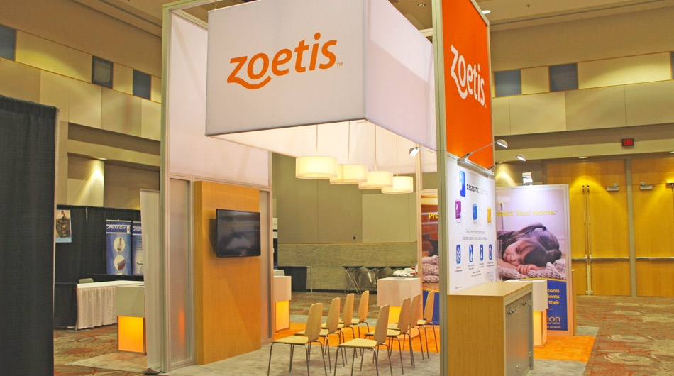
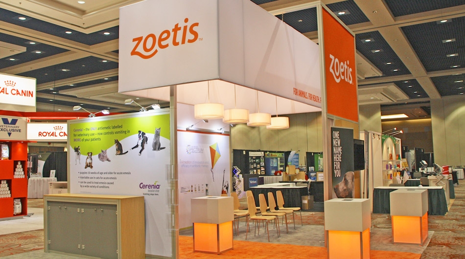
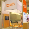
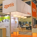
20 x 20 modular booth
Objective
Pfizer Canada, a customer since 1999, was going through a rebrand, and although this booth was initially developed for the Pfizer brand, the vision of this new design was to be taken with the new look and feel into consideration. The booth was to be flexible in size so that it could be used in an island configuration as well as inline configurations. It was to have a presentation area, video, interactivity, large imagery, and storage.
Solution
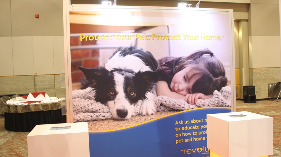
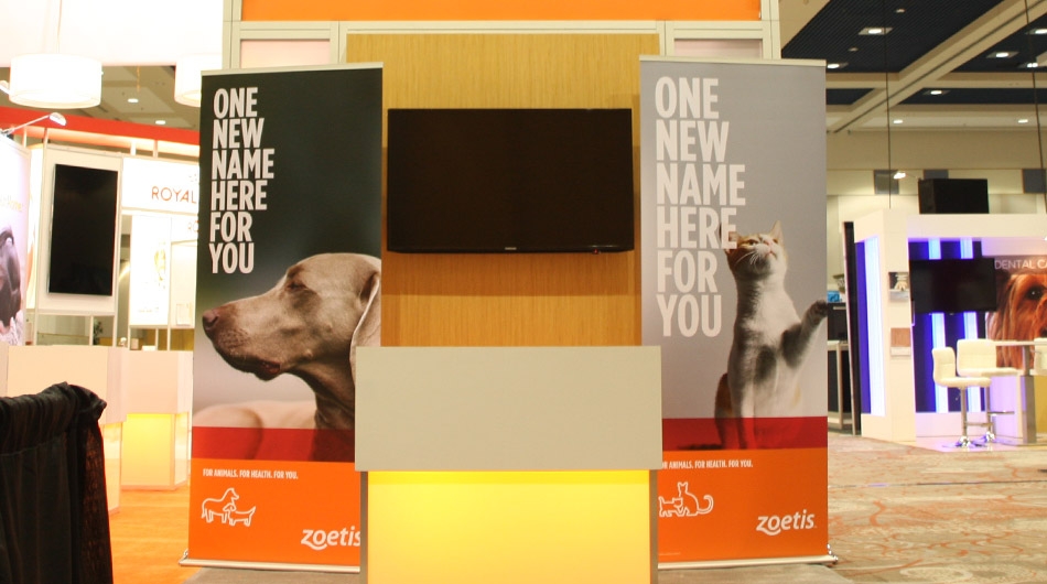
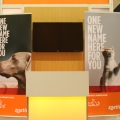
Stevens E3 developed a concept and ultimately a build that presented large format tensioned fabric graphics, strong overhead signage, warm, inviting lighting, and soft accent lighting in kiosks and stands. The booth commands attention, yet is inviting and warm. iPad stations and audiovisual were interspersed within the booth space that allowed for both individualize information gathering and interactivity, as well as larger group video presentations.

