Zucora
20 x 20 Custom Island Exhibit
Objective
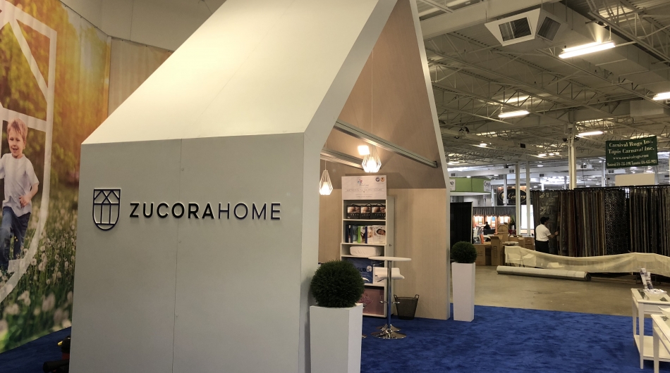
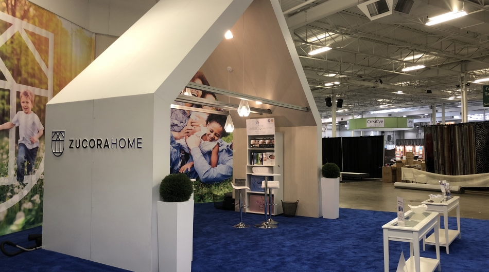
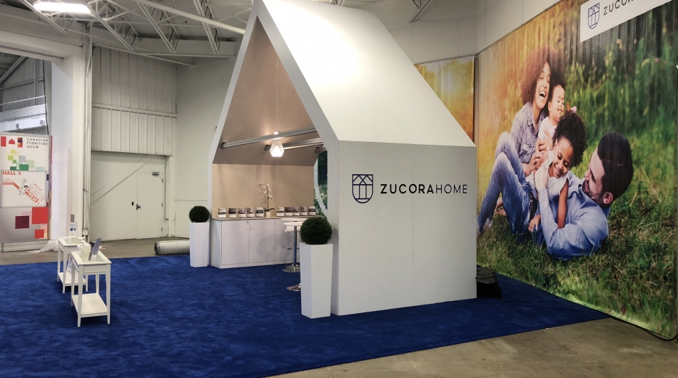
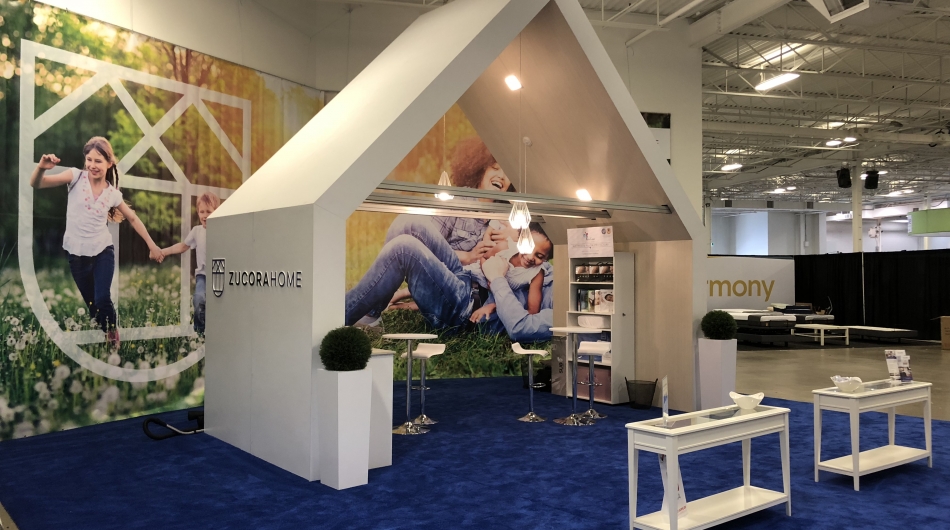
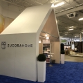
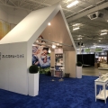
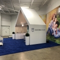
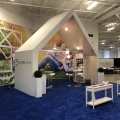
To design and manufacture a new custom exhibit for Zucora. An exhibit design that was simple with a clean look, to echo the new brand identity and logo of the company. Zucora was looking for a peaked roof above two side walls. They wanted a "European" look, that was open and contemporary. The peaked structure was to frame a view of fresh fields. The exhibit was to be pure white - a strong message to coordinate with their product lines. Under the peak, two informal meeting areas were needed to invite attendees to visit and meet with Zucora staff. An enclosed cabinet would store collateral material, give-aways and personal items. Large front counters were needed to display products.
Solution
stevense3 designed a stunning, high impact peaked roof for Zucora. The outer walls are pure white - the only graphic was a 3D mounted logo - for a clean, simple look. The inner walls and ceiling of the peak were made using a white washed paneling creating a contemporary European look. Recessed lighting and modern pendant lights added light and a modern feel to the booth. Mounted on the walls behind the display, large vinyl banners showed life style images. Inside the peak, a clean, white cabinet gave additional display area with ample storage during the show. At the entrance to the booth space modern counters gave additional areas for product display and a greeting area for attendees. Scattered plants added a "green" element to the overall environment. The results? The exhibit was a feature attraction at the show.

